David Gerbing, Ph.D, from Portland State University, explores professional, interactive data visualization for everyone through lessR
The world of data visualization can leave you to choose between expensive software or difficult-to-learn software. lessR simplifies the process of obtaining professional-quality data visualizations at no cost and with minimal effort. Anyone with a computer can download for free both R and its environment for analysis, RStudio. Please find more information at the same website I developed for my students, and you can view many examples.
First, read the data into R, usually with the name, d, which then serves as the default data name for the analysis functions. Using the lessR Read() function, enter the file location on your computer or on the web, enclosed in quotes, such as:
d <- Read(“https://dgerbing.github.io/data/Employee.xlsx”)
The file name can refer to an Excel sheet, a text file, or many other data formats. Leave the quotation marks empty to browse for your file: Read(“”).
The heart of the lessR workflow consists of three visualization functions that generally produce interactive visualizations that you can hover over with the mouse. The first, Chart(), visualizes grouped data. To count the number of employees in each department of a company, simply supply the variable name:
This single instruction produces a clean, professional bar chart that visually and numerically summarizes the data, accompanied by an easy-to-read table.
Across the three lessR visualization functions, the argument type specifies the type of plot. For Chart(), the default value is “bar”. Other possibilities include “radar”, “pie”, “bubble”, “treemap”, and “icicle”. Use the argument y to analyze a numerical variable. Create a multi-level pie chart called a sunburst chart of average Salary by Gender within each department:
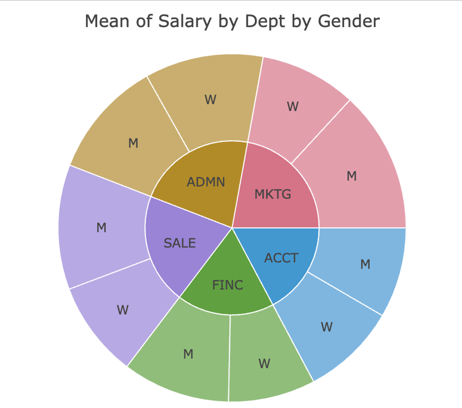
Chart(Dept, by=Gender, y=Salary, stat=”mean”, type=”pie”)
(See figure 2)
The second primary tool, X(), visualizes the distribution of a single numerical variable. What does the distribution look like? Are there outliers? To create a histogram of Salary, drawn using an enhanced approach that intelligently selects the number of bins, formatting, and displays key summary statistics, enter:
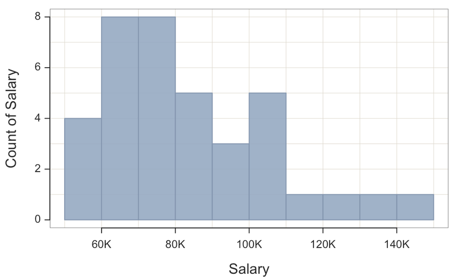
X(Salary)
(See figure 3)
Other visualizations of distributions, set by the type of argument, include “density” for a smooth curve and “vbs” for an integrated violin, box, and 1-dimensional scatter or strip plot. To include a grouping variable, lessR automatically produces overlapping or stacked distributions depending on the choice of argument by or facet. To compare separate distributions of Salary for men and women, with outliers identified by red points, enter:
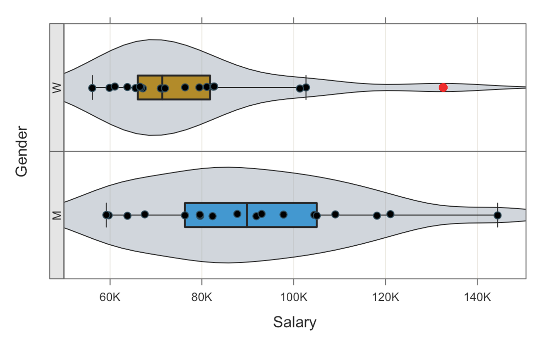
X(Salary, facet=Gender, type=”vbs”)
(See figure 4)
The third core lessR function, XY(), creates visualizations of relationships between two (or three) variables. One of the most common questions in any analysis is whether one variable predicts, influences, or correlates with another. With lessR, view the scatter plot with the best-fitting linear model, across groups, with:
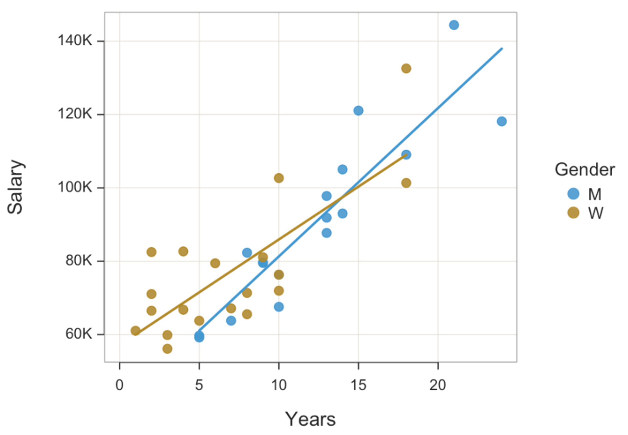
XY(Years, Salary, by=Gender, fit=”lm”)
(See figure 5)
The combination of ease of use and a unified experience across the three functions does not limit its power; many more straightforward customisations, such as custom colours, are available, along with other powerful analyses, such as a simply obtained comprehensive regression analysis.
Further reading
- Gerbing, D. W (2021). Enhancement of the Command-Line Environment for use in the Introductory Statistics Course and Beyond. Journal of Statistics and Data Science Education, 29(3), 251-266. DOI: https://doi.org/10.1080/26939169.2021.1999871.
- D Gerbing, The Integrated Violin-Box-Scatter (VBS) Plot to Visualize the Distribution of a Continuous Variable, Stats, 2024, 7 (3), 955-966. DOI: [https://doi.org/10.3390/stats7030058
- D. Gerbing. Data Visualization: Derive Meaning from Data, 2nd Edition, CRC Press, (forthcoming, 2026).